Tuesday, July 19, 2011

The role of posters in graphic design

Design Brief :
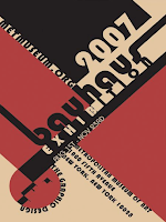
Design a Bauhaus inspired A3 poster for an open night at Stella Maris College 2012.

Process : 
researching poster and this history they have, found the style of posters that appeal to us. 

The Bauhaus design period was also researched, finding text, imagery and information that we believed to be relevant to this period.

we then made a mind map to express our ideas and direction we will take in our poster. we then found our related Bauhaus posters, and outlined why we think Bauhaus is individual. 

diagonal lines, dynamic colours, sharp lines, Bauhaus font. and a contemporary style.


firstly i choose my image of the school. 

i then edited the colours, and added sections of different color, and added in diagonal lines. similar to Bauhaus.


i then added in important information.


And joining lines.  


Finished Product.with school logo included.

Tuesday, May 17, 2011

MUGS

Our latest task
1. Design a commemorative Factory designer mug and have it printed online at Vistaprint
2. Design, print and manufacture a package to promote your mug at the factory

The mug was to resemble the factory (our working space)and to express the feelings and memories we have had here.
once done brainstorming on ideas and collaborating many ideas into one we then submitted our piece to be printed onto the mugs.

To start my design i drew my image, then scanned it. then edited the the colors so they were vibrant. i also made the black outlines bold. 


I wanted to include a strong text into my mug design. and i felt creative was a strong word to sum up the ideas and the feeling that the factory has.
This is the image of my final design.


We also created boxes to package our mugs. This is an example of the template we used to create the box. once we printed this, we then cut it out and made our box.

The final design. 

Monday, January 31, 2011

CHALK BOARDS


Last year we were asked to redesign a chalk board of a chosen cafe. The cafe i chose was a cosy little cafe in harbord called the kitchen door. the cafe is arty and is full on vintage furniture, the chalk board i design had to reflect this. My chalk board is in the shape of a mug, this resembles coffees and other typical cafe drinks. The menu is only for warm drinks and i have made them in the font of the cafe which is oranges, reds peachy colours all warm colours.

Wednesday, September 1, 2010

Redesigning the American bill

Dowling Duncan redesign the US bank notes

Dowling Duncan a design firm in America has taken on a task to modernize the American Bill. everything on the note has change apart from the value of the money. The new bills have more meaning and are design in a smarter, more convenient way.

Richard Smith states that he ‘wants to rebrand the US Dollar, rebuild financial confidence and revive our failing economy.’


 5 dollar bill 

the notes have been redesigned in there size also, the width is thinner and the less value notes have the shorter they are. The design is also made vertically.   

When stacked on top of each other it is easy to see how much money you have. It also makes it easier for the visually impaired to distinguish between notes.

Notes are determined by there color and recognized by there color so making bright vibrant colors was there idea. 

this 5 dollar note represents the five biggest native American tribes this is Americas history, the themes to the notes is to represents good changes America has made or good parts in history for Americans. The text is clear on the notes and easy to read, and layout design is vertical as it is more common that we handle notes in vertical form. 

Monday, August 30, 2010

Board Shorts

Apart of our course was to design a pair of board shorts using only geometric or organic shapes. We are to construct a simple pattern that can be repeated to form a yardage. We got given a board short template to lay over our yardage to show a mock up of our design. The board shorts were to be completed to the point that we could get them made. We have to create 3 color variations of the design in accordance of three of the following: Summer, Contrasting colors, harmonious colors, winter, spring, monochromatic, Autumn, retro or other.
I chose Spring, Summer, Winter


 In Bloom

Using one of my paintings i picked the parts of the painting i thought suited the board shorts most, these pair represented spring in the way that they have warmth colors through them as well as the cold blue colors.


Come as you are

A drawing which i had done, i picked the pieces and put in together on the board short template.  This design represented summer with the lime and yellow colors.


Drain you

Water color painting on canvas, then cropped and placed onto the board shorts. These blue minty colors represent winter as they have aquas, purples and blues through them.


A full description of the board shorts and there meanings.

BUNDANON

Bundanon was a place where we were inspired to design and create. We went as apart of our graphic design coarse. As our design brief was to create a cafe that would fit into the Bundanon landscape this included brainstorming ideas so the cafe was environmentally helpful. We made the models over 3 days, using foam, cardboard, wood wire and paints.


The Bundanon Landscape which or cafe would fit into environmentally, physically and share similar design style. 
Above is an image of my Cafe, i think the Design fits into the bundanon environment well as it uses natural materials like wood. the positives of my design were i like the curved shapes in the cafe design and the warm colors in represents. In my design i made a shelter with wood that slants down, this design was to keep shade and also protect from the rain. there are four main places of my cafe, the outside shaded area, the kitchen, the bar/drink place and the food area. Negative aspect of my cafe was that it was a bit large, and for the amount of visitors to bundanon the space could be to big.


Image 2 > abc.net.au

Sunday, May 2, 2010

Blog Banner Process

We were asked to design a blog banner that represents our personal style. The banner took us 4 to 6 weeks to process, as we used photo-shop to use tools.

in our banner we were to include
- Our name to clearly represent who did the banner
- Our own personal style
- An interesting banner that will engage people 
This is the image i started with, which i sketch up and scanned into photo-shop. I then deleted sections i wish to replace with images.
This image was placed in the background of my sketch, the image is also an artwork i created i used this image so the banner was more personal and original.
Adding more layers with the crop and paste tool.
This is the final layer i added to my blog banner i chose these patterns and designs as they are attractive on my banner and all relate to my style, i have included water, and my own artworks.

then we were asked to add a text representing our banner, using the text tool i chose black is it stands out clearly against the blue background. The text is simple easy to read, In my text i wrote my name and using the keyboard symbols i made the sign of pisces which relates to my blog name.