We were asked to design a blog banner that represents our personal style. The banner took us 4 to 6 weeks to process, as we used photo-shop to use tools.
in our banner we were to include
- Our name to clearly represent who did the banner
- Our own personal style
- An interesting banner that will engage people

This is the image i started with, which i sketch up and scanned into photo-shop. I then deleted sections i wish to replace with images.

This image was placed in the background of my sketch, the image is also an artwork i created i used this image so the banner was more personal and original.

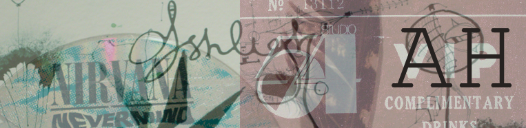
Adding more layers with the crop and paste tool.


This is the final layer i added to my blog banner i chose these patterns and designs as they are attractive on my banner and all relate to my style, i have included water, and my own artworks.
then we were asked to add a text representing our banner, using the text tool i chose black is it stands out clearly against the blue background. The text is simple easy to read, In my text i wrote my name and using the keyboard symbols i made the sign of pisces which relates to my blog name.

Your blog banner has a very textural quality to it that contrasts nicely with the white space. The tree shape in the middle of the design acts as space to rest your eye from the detail on either side.
ReplyDeleteHey ash,
ReplyDeleteI really enjoy studying your banner as you have used so many different patterns and your sketch is very detailed and interesting.
I love the way you have used your artistic ability towards your banner then added certain effects to it using photoshop.
You have made your banner meet the design brief by including your name with the pisces sign which represents you and your strong interest instar signs.
The colours and patterns used are successful and effective but I believe your most successful part of your design is your original sketch. You got talent chick!
WOW. Your blog banner is amazing ash, i love how it connects to you personally, and that your own work is in it. You also seem to have a good talent in photoshop as the branches coming down from the tree would have had to been lassoo'ed, which is time consuming. I think that you have made your blog banner fit into the design brief as your name is simple and easy to read and the patterns and sketches all fit together. I think that the most successful part of your design is definately your sketch of the tree and the painting behind it, they contast really well and it looks awesome! WAY TO GO GIRL!
ReplyDeleteashh, ur banner caught my eye as soon as i opened your blog, i find it really interesting, especially with the tree in the middle to separate the two journeys that your eyes can take...
ReplyDeletei find the colours really go well with the sketch and i especially like the little bubble travelling with the water on the left hand side...
i also like the fact that you have kept some parts of the design white; looks very effective.
You have created a very nice banner....WELLL DONEEE ASHHH!!! haha
hey,
ReplyDeletei love your banner, i realy like the use of texture and colour. i love how you have the bubble flowing with the movement of the water and i love the hand drawn sketchs...
well done!!
holly molly this is amazing, your an amazing artist, i love that its so different and doesn't have just one style. i really love the background its contrasts really well with the rest of the design.
ReplyDeletenice work!!